Smooching Sydney: hot hot incinerator love

Part of the 'Speed-Dating Cities' series.


Sources: here and here.

Given that my current series this fortnight is on my favourite buildings in Australia, I'd be lying if I said any building in Australia (and the world) came even a remote second to the Sydney Opera House. I think its effect on me can be summed up with this particular bit trivia: I basically decided to enter the world of construction at the age of 6 because of photos I had seen on my old man's office walls of the Opera House being built. Of course my old man wanted me to be a whizz-bang engineer like the incredible Peter Rice and Ove Arup... but I ended up chasing down quite a different path to get here.

But since I will most likely dedicate an entire series of posts just to the Opera House, I figured I'd go back in time a little and have a little fantasy date with another gem from Sydney - and yes, it's hot, hot, hot...


Walter Burley Griffin and Marion Mahony Griffin's
Pyrmont Incinerator.

In use from 1937 to 1971, the incinerator seared itself into the architectural heritage of the Pyrmont peninsula (largely industrial at the time), a strategically modern cubist design that was embellished with Aztec / Mayan-inspired ornamentation. The Griffins had been inspired by the ongoing work of scientists in the '30s to "smash the atom", and employed the geometric reliefs to capture the idea of energy being released - a rather naive sentiment when seen from today. Envisaged as a beacon of 20th century architecture, the incinerator fell to ruin over the next two decades after decommissioning, resembling more and more the Central American ruins that had impressed themselves on the Griffins. In 1992, after numerous protracted attempts to save it, the remaining structure was demolished.


Reminds me a bit of Avanto Architect's Chapel of St Lawrence, Vantaa, Finland (has these awesome copper ceiling panels) Source: here.


Pyrmont Incinerator images sourced: here and here.


Tiles from the Pyrmont Incinerator
Source: here.

Magic Mummy Melbourne: yes, it's a mum date

This post is part of my 'Speed-Dating Cities' series.


A mate said to me yesterday, "So Geek Buck.... you're doing a whole series on Australian Architecture over the next fortnight. One problem: You're from Melbourne. You were born there. It's your mother-city. You can't be dating your own mother.... or can you?"

Well, I can...
(Stop it. Put that nasty, judge-y face away)

It's just a date. Besides, I think it's important to spend one-on-one time with your folks... take 'em out to the movies, a nice dinner, maybe a slow stroll somewhere quiet. I've always found my one-on-one time with my parents pretty brilliant. Heck, I even have dad-dates with my old man - I show him how appalling I am at bowling, and he demonstrates how even though he can't see the bowling ball (beer gut), he still knocks 'em blind.

So, today, this one's for you, Mamma Melbourne:
- - - - - - - - - - - - - - - - - - - - - - - - - - - - - - - - - -

There is an undeniably 'graphic' quality to the way Melbourne's architectural language is becoming - more so in the last decade. This might sound somewhat positive, but there are drawbacks to having your architects design buildings for future photo-ops. Invariably, when in the hands of less skillful spatial artisans, the spaces (inside and out) get streamlined to a clinical iconography that fails to accept the everyday wear-and-tear and smudgy little hand prints of people like us. I had a mate whose father a pretty well-known architect in canberra, and he used to hate the way his home felt. You could never touch anything, it was always in this pristine glossy-architectural-magazine state that made him want to piss his dad off by shuffling the magazine pile.

Okaaaaay. Yes: shuffling the magazine pile.

But who can deny the power of the hero-graphic building image. Take the wavy GT Tower East by Dutch architects ArchitectenConsort:

Source: here

Sure, it looks all neat and cool here with the triple point perspective going for it. But if you've seen elevations, it seems quite... ordinary. Yes, sometimes in the design process, "less is more", and a single, unique architectural language speaks volumes. But dialogue with the surrounding environment can be a lot more powerful.

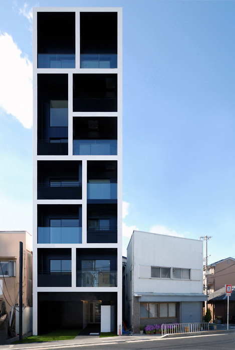
Or maybe too powerful.... here we have an apartment block detailed such that it appears almost a caricature of a building:

Source: here

I admit: I quite like the intentionally darkened negative space, and the choice of materials and clean detailing of the glass balustrade - the blue on blues, against a blue background/ sky, with the robust vertical and horizontal lines... but it doesn't quite refrain from dominating the space. Maybe that's the intention, but somehow, it doesn't quite work for me.

But even though these anime-ish buildings are symptomatic of an architectural design paradigm geared to positioning a city globally in a "HELLO? LOOK AT MEEEEE" way... sometimes, the scale is just right... and the building wears the city like a garment that peels away as you look closer at its curves (or angles). Like Monaco House, in Ridgway Place, Melbourne: (I'll talk more about this building in a future post)


Source: here.

The thing is, many of these buildings are designed to consume their narrow sites with glee, giving very little back to the city. But I think designers should try for just a little bit more civic minded-ness (or, in the words of Mark H. Moore: "Public Value"). It's this giving back to the city that provides an opportunity for a building to back away from its own image and not take itself so seriously. It's about being inviting and creating space for the everyday, for the average Joe/ Jane and everyone in-between to be grubby.

My favourite building in Melbourne - and I have to stress, 'building', because there are so many things to love about Melbourne - is the Victorian College of Arts' Hub Building (also known as the Centre for Ideas).


The windows and "balls" of the building are based on this concept of constellations, with the cladding on the facade reacting to the positions of these balls and windows. I don't think I've seen a building capture movement as well as Minifie Nixon's design for the hub building - architects tend to be less able at capturing this quality than sculptors - and few architects conceive of their buildings as anything but big burly static objects.

The building looks at once like a bullet-ridden sculpture, capturing the momentum and force of, to push the analogy, ideas - yet recalls ripples in the water, when a small pebble (like an idea) is thrown in, and an entire ripple tank of gravitas ensues. Others think it resembles a holey-cheese (Holy Cheese?).

But beyond a pioneer design employing the mathematics of Voronoi Tessellation to pull together the fenestration and cladding, what I like about the building is how it sits within the campus. If you've had the chance to visit, pay attention to how you approach to building: you actually have to walk up this truncated alley to get to the building - and Rushwright's landscape suddenly enfolds you and almost prepares your senses to the experience of the building. Both plantings and inserted hard elements are extremely well executed and developed to counterpoint the building brilliantly.


Images sourced from here and here

Barcelona and Me: One Night Only in Shanghai

This post is part of my 'Speed-Dating Cities' series...
- - - - - -

Oh Barcelona,

you and I go way back - and I'm sorry I haven't called in a while. But our recent hook up in Shanghai was off the charts. We even made a little (or big, depending on which scale you're coming from) love child:

Miguelin, our 6.5 m breathing and blinking Geek Buck-Barcelona love child.
Picture source: here

- - - - - - -

Benedetta Tagliabue, of EMBT in Barcelona, created this incredible woven crib for Miguelin - the Spanish Pavilion, Shanghai Expo 2010.

Central to the pavilion's design is the theme "From the City of Our Parents to the City of Our Children" - this pan-generational vision of stewardship for the city - which takes form as a sensual, worldly and womanly structure that almost caresses the surface of the site. That the design is able to successfully embrace the breadth of ideas explored below, without coming across as architectural white noise, is testament to the unyielding control Tagliabue exercises over the design and execution of the piece.

Source: here. Foxmachia.

Visually, the most powerful part of the design is the tiger-skin cladding that celebrates the Chinese zodiac year of the "Tiger". The panels, made in Shandong province, are meticulously assembled on site, reinforcing Tagliabue's deft marriage of the Spanish wicker basketwork tradition with local Chinese skills. The nod to the host is further carried through in the assemblage with the black panels configured to read as "moon" and "sun", a hidden Chinese calligraphy over the surface of the structure.


Chinese calligraphy over the surface of the Spanish Pavilion
Sources: here and here.


The fluid form of the structure was derived from the skirts of a flamenco dancer, executed so that a series of basket-courtyards are produced that embraces movement through the space (though in reality, an Expo in China probably required careful management of traffic through the space and would hardly be as free-flowing as the architecture tries to imply):


Light filtering through the weaves - known as "mimbre" in Spanish, the word conjuring an easy reference to membrane, one that allows in the outside, that wraps more than it encloses.

Source: the above 4 photos from here.

Source: here


Love the construction process - particularly the image of the traditional Chinese bamboo scaffolding against the structural steel of the pavilion:


Tagliabue with dignitaries at the pavilion.

Sources: last 6 photos from here and here.

I've got that Sinking Feeling: Oh Oily Rocks


Sometimes, against my better judgement, I end up dating cities that can only best be described as... quirky. My recent date with Oily Rocks (Neft Daslari) was one such encounter. I had formed this somewhat romantic view of this city after read a somewhat misleading article celebrating the tenacity of her library, this unique coral conurbation lost to time, falling apart, and so terribly solipsistic....

Come on, how could you not fall in love with her? It's like an internet dating profile that keeps giving and giving, drawing you in like a moth to a flame:

But Oily Rocks belongs to neither Azerbaijan's cosmopolitan past—when the Nobels and Rothschilds made fortunes here—nor its global future. It was built in the 1940's, when the Soviet Socialist Republic of Azerbaijan was part of the U.S.S.R. and oil from the Caspian was helping to establish Communism. Oily Rocks is the oldest, biggest, strangest oil platform in the world, but superlatives fail to capture the overwhelmingly insane spirit of this place. Nothing about it is natural. The whole structure is built on platforms supported by corroded metal poles that stand in about 40 feet of water. At one time, 120 miles of raised roads connected the wells and dormitories and ancillary buildings—including helicopter platforms, a power station, and a bakery—but three-quarters of them have fallen apart. Source: here.

So there I was, on a date with the first offshore oil platform to ever be constructed in 1949. The Post-WWII Soviet regime, hungry for industrial validation, launches an impetuous urban arm 42 kilometres out into the Caspian Sea... beginning the strangest urban adventure in the sea.


Ships were sunk to be used as foundations, and 300 to 350 kilometres of pathways were built - an entire man-made city perched atop the Caspian Sea. In an ironic twist, thirty years later, the oil crisis of the late '70s would see a glut of marine-based utopias, ideal cities colonising inhospitable ocean space (and even polar ice caps) to bring new ways of living with lower dependency on oil.

But here, in the bosom of Azerbaijan's oil industry - was Oily Rocks - a marine utopia supported by oil.


All Oily Rocks images: Source.

In the end, it just didn't work out with Oily Rocks. It wasn't so much her uninspired name, or the fact that she was operating in life at a quarter of her true potential... she was just all work. Utilitarian. The best parts of her - the little grass field where kids used to play, the schools, even fountains - have all gone.

But isn't it fascinating how the more things change, the more they stay the same? Here are some recent dating invitations from artificial reefs that remind me of my horror date with Oily Rocks:


Aircraft carrier USS Oriskany, Florida. Sunk in May 2006.

The main impetus driving this recent colonisation of ocean space is eco-tourism - sunk boats, tanks, train carriages etc form artificial reefs and ideal diving sites, tourist attractions under the surface of the sea.

Below, 2 images of Jason de Caires Taylor's "Silent Evolution", a piece to be slowly colonised by coral.


Sunk superstructure of Gen Hoyt S. Vanderberg, Florida Keys


Underwater cemetery in Florida.


A Jordanian tank sunk in the Gulf of Aqaba, Red Sea.

Last six images from here.

But talking about coral build up, here's a city I would date. It's the Autopia Ampere

Source: here.

By German Architect, Wolf Hilbertz, it uses electrochemical reactions to draw sea minerals into a built mesh that then forms a city-exoskeleton of calcium carbonate in the ocean.

Now that's a sexy sea city.