This post is part of my 'Speed-Dating Cities' series.

A mate said to me yesterday, "So Geek Buck.... you're doing a whole series on Australian Architecture over the next fortnight. One problem: You're from Melbourne. You were born there. It's your mother-city. You can't be dating your own mother.... or can you?"
Well, I can...
(Stop it. Put that nasty, judge-y face away)
It's just a date. Besides, I think it's important to spend one-on-one time with your folks... take 'em out to the movies, a nice dinner, maybe a slow stroll somewhere quiet. I've always found my one-on-one time with my parents pretty brilliant. Heck, I even have dad-dates with my old man - I show him how appalling I am at bowling, and he demonstrates how even though he can't see the bowling ball (beer gut), he still knocks 'em blind.
So, today, this one's for you, Mamma Melbourne:
- - - - - - - - - - - - - - - - - - - - - - - - - - - - - - - - - -
There is an undeniably 'graphic' quality to the way Melbourne's architectural language is becoming - more so in the last decade. This might sound somewhat positive, but there are drawbacks to having your architects design buildings for future photo-ops. Invariably, when in the hands of less skillful spatial artisans, the spaces (inside and out) get streamlined to a clinical iconography that fails to accept the everyday wear-and-tear and smudgy little hand prints of people like us. I had a mate whose father a pretty well-known architect in canberra, and he used to hate the way his home felt. You could never touch anything, it was always in this pristine glossy-architectural-magazine state that made him want to piss his dad off by shuffling the magazine pile.
Okaaaaay. Yes: shuffling the magazine pile.
But who can deny the power of the hero-graphic building image. Take the wavy GT Tower East by Dutch architects ArchitectenConsort:

Source: here
Sure, it looks all neat and cool here with the triple point perspective going for it. But if you've seen elevations, it seems quite... ordinary. Yes, sometimes in the design process, "less is more", and a single, unique architectural language speaks volumes. But dialogue with the surrounding environment can be a lot more powerful.
Or maybe too powerful.... here we have an apartment block detailed such that it appears almost a caricature of a building:
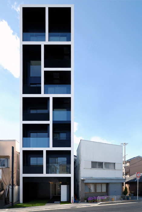
Source: here
I admit: I quite like the intentionally darkened negative space, and the choice of materials and clean detailing of the glass balustrade - the blue on blues, against a blue background/ sky, with the robust vertical and horizontal lines... but it doesn't quite refrain from dominating the space. Maybe that's the intention, but somehow, it doesn't quite work for me.
But even though these anime-ish buildings are symptomatic of an architectural design paradigm geared to positioning a city globally in a "HELLO? LOOK AT MEEEEE" way... sometimes, the scale is just right... and the building wears the city like a garment that peels away as you look closer at its curves (or angles). Like Monaco House, in Ridgway Place, Melbourne: (I'll talk more about this building in a future post)

Source: here.
The thing is, many of these buildings are designed to consume their narrow sites with glee, giving very little back to the city. But I think designers should try for just a little bit more civic minded-ness (or, in the words of Mark H. Moore: "Public Value"). It's this giving back to the city that provides an opportunity for a building to back away from its own image and not take itself so seriously. It's about being inviting and creating space for the everyday, for the average Joe/ Jane and everyone in-between to be grubby.
My favourite building in Melbourne - and I have to stress, 'building', because there are so many things to love about Melbourne - is the Victorian College of Arts' Hub Building (also known as the Centre for Ideas).

The windows and "balls" of the building are based on this concept of constellations, with the cladding on the facade reacting to the positions of these balls and windows. I don't think I've seen a building capture movement as well as Minifie Nixon's design for the hub building - architects tend to be less able at capturing this quality than sculptors - and few architects conceive of their buildings as anything but big burly static objects.
The building looks at once like a bullet-ridden sculpture, capturing the momentum and force of, to push the analogy, ideas - yet recalls ripples in the water, when a small pebble (like an idea) is thrown in, and an entire ripple tank of gravitas ensues. Others think it resembles a holey-cheese (Holy Cheese?).
But beyond a pioneer design employing the mathematics of Voronoi Tessellation to pull together the fenestration and cladding, what I like about the building is how it sits within the campus. If you've had the chance to visit, pay attention to how you approach to building: you actually have to walk up this truncated alley to get to the building - and Rushwright's landscape suddenly enfolds you and almost prepares your senses to the experience of the building. Both plantings and inserted hard elements are extremely well executed and developed to counterpoint the building brilliantly.


Images sourced from here and here
A mate said to me yesterday, "So Geek Buck.... you're doing a whole series on Australian Architecture over the next fortnight. One problem: You're from Melbourne. You were born there. It's your mother-city. You can't be dating your own mother.... or can you?"
Well, I can...
(Stop it. Put that nasty, judge-y face away)
It's just a date. Besides, I think it's important to spend one-on-one time with your folks... take 'em out to the movies, a nice dinner, maybe a slow stroll somewhere quiet. I've always found my one-on-one time with my parents pretty brilliant. Heck, I even have dad-dates with my old man - I show him how appalling I am at bowling, and he demonstrates how even though he can't see the bowling ball (beer gut), he still knocks 'em blind.
So, today, this one's for you, Mamma Melbourne:
- - - - - - - - - - - - - - - - - - - - - - - - - - - - - - - - - -
There is an undeniably 'graphic' quality to the way Melbourne's architectural language is becoming - more so in the last decade. This might sound somewhat positive, but there are drawbacks to having your architects design buildings for future photo-ops. Invariably, when in the hands of less skillful spatial artisans, the spaces (inside and out) get streamlined to a clinical iconography that fails to accept the everyday wear-and-tear and smudgy little hand prints of people like us. I had a mate whose father a pretty well-known architect in canberra, and he used to hate the way his home felt. You could never touch anything, it was always in this pristine glossy-architectural-magazine state that made him want to piss his dad off by shuffling the magazine pile.
Okaaaaay. Yes: shuffling the magazine pile.
But who can deny the power of the hero-graphic building image. Take the wavy GT Tower East by Dutch architects ArchitectenConsort:
Source: here
Sure, it looks all neat and cool here with the triple point perspective going for it. But if you've seen elevations, it seems quite... ordinary. Yes, sometimes in the design process, "less is more", and a single, unique architectural language speaks volumes. But dialogue with the surrounding environment can be a lot more powerful.
Or maybe too powerful.... here we have an apartment block detailed such that it appears almost a caricature of a building:
Source: here
I admit: I quite like the intentionally darkened negative space, and the choice of materials and clean detailing of the glass balustrade - the blue on blues, against a blue background/ sky, with the robust vertical and horizontal lines... but it doesn't quite refrain from dominating the space. Maybe that's the intention, but somehow, it doesn't quite work for me.
But even though these anime-ish buildings are symptomatic of an architectural design paradigm geared to positioning a city globally in a "HELLO? LOOK AT MEEEEE" way... sometimes, the scale is just right... and the building wears the city like a garment that peels away as you look closer at its curves (or angles). Like Monaco House, in Ridgway Place, Melbourne: (I'll talk more about this building in a future post)
Source: here.
The thing is, many of these buildings are designed to consume their narrow sites with glee, giving very little back to the city. But I think designers should try for just a little bit more civic minded-ness (or, in the words of Mark H. Moore: "Public Value"). It's this giving back to the city that provides an opportunity for a building to back away from its own image and not take itself so seriously. It's about being inviting and creating space for the everyday, for the average Joe/ Jane and everyone in-between to be grubby.
My favourite building in Melbourne - and I have to stress, 'building', because there are so many things to love about Melbourne - is the Victorian College of Arts' Hub Building (also known as the Centre for Ideas).
The windows and "balls" of the building are based on this concept of constellations, with the cladding on the facade reacting to the positions of these balls and windows. I don't think I've seen a building capture movement as well as Minifie Nixon's design for the hub building - architects tend to be less able at capturing this quality than sculptors - and few architects conceive of their buildings as anything but big burly static objects.
The building looks at once like a bullet-ridden sculpture, capturing the momentum and force of, to push the analogy, ideas - yet recalls ripples in the water, when a small pebble (like an idea) is thrown in, and an entire ripple tank of gravitas ensues. Others think it resembles a holey-cheese (Holy Cheese?).
But beyond a pioneer design employing the mathematics of Voronoi Tessellation to pull together the fenestration and cladding, what I like about the building is how it sits within the campus. If you've had the chance to visit, pay attention to how you approach to building: you actually have to walk up this truncated alley to get to the building - and Rushwright's landscape suddenly enfolds you and almost prepares your senses to the experience of the building. Both plantings and inserted hard elements are extremely well executed and developed to counterpoint the building brilliantly.


Images sourced from here and here
No comments:
Post a Comment
Hello There! Leave me a message - particularly if you've got a city in mind for me to date! The Geek Buck's a huge fan of matchmakers.